

Adapted from Fostering Math Practices
The purpose of this Mini-lesson is to reinforce the importance of looking carefully at the scale of the axes when finding distances on the coordinate plane. Show scholars all representations below. Ask them which description and coordinates match which points on the graph. Give scholars time to think independently and discuss with a partner before sharing out. Once all scholars are convinced of the representations that match, have them write the coordinates and a description of the remaining point and plot the point with the remaining coordinates on the graph.
Martine has used a coordinate plane to model a soccer field to show her teammates some plays she has planned for their next game. The points plotted above represent some of the players on Martine’s team. Determine which description matches which point, and plot the point that is missing.
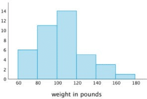
The purpose of this Mini-lesson is to review how to read line plots or dot plots from Grade 5, and to introduce histograms as another way of representing similar information. Use this Mini-lesson to define the term histogram and to discuss key features that differentiate histograms from line plots or dot plots. In particular, histograms tell you the frequency of data points within a certain range, but they don’t tell you exactly what those data points are.
Scholars learned how to create and interpret line plots in Grade 5, but they may need a reminder. Clarify for scholars that these dot plots are the same as the line plots they saw in Grade 5; they just use different symbols. Use this time to ensure that scholars can accurately read the number of data points, the frequency of each value, and the value of each data point from the line plot before moving on.
Put up the representations and ask scholars which plots could represent the same data sets. Give them time to think independently and discuss with a partner before sharing, and press scholars to explain specific features of the data sets that are or are not the same in the different representations. Once scholars convince one another that the first dot plot matches the histogram, have scholars create their own histogram that matches the second dot plot.
These data sets correspond to the weights of dogs at different shelters.

Note that in this histogram, each range includes the left-end value but not the right-end value. Tell scholars that this is a decision that mathematicians make, and set the expectation that they clarify this when drawing histograms.
The purpose of this Mini-lesson is to have scholars practice reading and comparing histograms. In addition, this Mini-lesson is designed to get scholars thinking about what information histograms reveal and what is still left uncertain when data sets are displayed in histograms.
Put up the representations and ask scholars which plots could represent the same data set. Give them time to think independently and discuss with a partner before sharing, and press scholars to explain specific features of the data sets that are or are not the same in the different representations. Press scholars to explain whether the data sets must match, could match, or could not possibly match, and to support their reasoning. Once scholars convince each other that Histograms 1 and 3, but not Histogram 2, could represent the same data set (though we don’t know for sure) have them invent their own data set that will match both Histogram 1 and 3.
These data sets correspond to the average temperatures for each day in a month. Which displays could represent the temperatures for the same month?
The purpose of this Mini-lesson is to expose scholars to the limits of using mean and range to describe different data sets. This Mini-lesson provides a motivation and justification for exploring the new value you will define with scholars today – the mean absolute deviation (MAD). During this time, your focus should be on solidifying their understanding of mean and range by getting scholars to explain how it’s possible for data sets that look so different to have the same mean and range. We do not expect scholars to discover the MAD on their own, but we do want to ensure that they understand why the MAD is important and when it is useful.
Put up the representations and ask scholars which descriptions and displays could match. Give them time to think independently and discuss with a partner before sharing, and press scholars to explain specific features of the data sets that are or are not the same in the different representations. Once scholars convince one another that each dot plot matches the mean and
range given, ask them whether they think those measures are good summaries of these data sets, and what features make the data sets different.


The purpose of this lesson is to give scholars practice with estimating mean and MAD visually and interpreting data sets in context. Put up the dot plots and the descriptions and ask scholars which description matches each dot plot. Give scholars time to think independently and discuss with a partner before sharing out. Press them to explain how they can estimate the MAD without calculating, and then have them calculate it to prove their answer.
Once they have paired each dot plot with a situation, have them describe or sketch a data set that would match the remaining description. If time permits, have scholars create a data set with that exact MAD, but if not, have them describe how that data set would compare to the other two.
The goal of this Mini-lesson is for scholars to practice finding the median and using the mean and the median to describe a “typical” value of a data set.
Put up the representations and medians and ask scholars which ones match. Give scholars time to think independently then discuss with a partner before sharing out.
These dot plots represent the heights, in centimeters, of the the first 22 presidents and the next 22 presidents.
The purpose of this Mini-lesson is to have scholars practice interpreting histograms and finding median and interquartile ranges (IQR). Focus your discussion on what scholars can infer from the histograms, and what they still don’t know about these data sets.
Show scholars one of the histograms first and ask whether it is possible to calculate the median exactly from this representation, and if not, how scholars can use this representation to estimate the median. Once scholars have reasoned about how to use the frequencies to estimate the median, show all the representations and ask them which description matches which histogram. Give them time to think independently and discuss with a partner before sharing, and press scholars to explain how they can estimate the IQR for each histogram.
Tell scholars that the histograms below show the ages of people at a birthday party and at a park.
The purpose of this Mini-lesson is to have scholars practice comparing data sets that are represented in different ways and making inferences about these data sets. Put up the representations and ask scholars which ones could represent the same data set. They should quickly notice that the two histograms could represent the same data set, so press them to explain whether the box plots could also represent these data sets and to use specific features of the representations to justify their answers.
Each plot represents the number of math homework problems scholars completed over ten days.
The purpose of this routine is to give scholars practice with pinpointing what must match up between complicated situations and the simulations that could be used to analyze them.
Display all situations and simulations, and ask which simulation could represent each situation. Press scholars to use theoretical and experimental probabilities to clearly explain why the simulations match. For the situation that doesn’t match either simulation, have scholars design their own simulations and share out.
| Situations | Simulations |
|---|---|
|
|
|
|
|
The purpose of this routine is for scholars to practice explaining how random events can be used to simulate complicated situations. Build on your conversations from Lesson 3 by getting scholars to think about whether they would have an easier time envisioning the possible outcomes and relative likelihood of each for the situations or the simulations, and about how envisioning all possible outcomes changes when the event is repeated. These ideas will be solidified during the Discourse.
Display all situations and simulations, and ask which simulation could represent each situation. For the situation that doesn’t match either simulation, have scholars design their own simulations and share out.
| Situations | Simulations |
|---|---|
|
|
|
|
|
The purpose of this Mini-lesson is for scholars to practice visualizing sample spaces of compound events and interpreting tree diagrams to determine which ones match. Once scholars agree on which event and sample space match below, have them represent the sample space of the remaining event and describe an event that matches the remaining tree diagram.
| Events | Sample Spaces |
|---|---|
|
|
|
Scholars should have calculators during this time.
The purpose of this Mini-lesson is to review how to calculate mean and mean absolute deviation (MAD). Open by asking scholars what they remember about mean and mean absolute deviation from Grade 6. At this point, they should say things like, “Mean is the average” and “MAD tells us something about how spread apart the points are.” Put up all five representations and ask scholars to match the numerical values to the corresponding dot plots.
Scholars learned how to calculate these values in Grade 6, but they will likely need a reminder. Push scholars to interpret these values informally (i.e., a larger MAD means more variation) before reviewing how to calculate the MAD of the first two data sets (dot plots A and B). Use these
calculations to have scholars evaluate their interpretations, and finish the Mini-lesson by having scholars calculate the mean and MAD of the third dot plot (dot plot C) on their own.
| Dot Plots | Mean and MAD |
|---|---|
These data sets correspond to the length, in minutes, of songs on different CDs. |
|
|
The purpose of this Mini-lesson is to review the meaning of median and interquartile range (IQR), and how those values are represented in box plots. First, ask scholars what they remember about what the median and interquartile range tell you about a data set. Then show all the representations below and ask them which box plots match which person’s data. Finish the Mini-lesson by telling scholars that the third box plot represents Maria’s paper airplane and asking them to find the median and IQR from the box plot.
During this discussion, label the median and IQR directly on each box plot and leave this up for your class to reference during the Explore. They will return to analyzing and comparing box plots later on in this lesson.
| Box Plots | Median and IQR |
|---|---|
Three scholars built paper airplanes and tested to see how far they would fly. |
|
|
The goal of this Mini-lesson is to introduce scholars to factored form and to have them articulate how and why the factors of quadratic functions are related to the x-intercepts. Throughout this lesson, you must stay focused on interpreting factors and x-intercepts in terms of multiplication. While some scholars might recognize that the zeros of the function are equivalent to p and q in the factored form y = (x – p)(x – q), it is much more important that scholars are able to use an understanding of the meaning of x–intercepts and the zero property of multiplication to prove their thinking. Because of the extensive precision errors scholars make when subtracting negative numbers, simply memorizing how to use the values of p and q to graph a quadratic function is inevitably going to lead to mistakes.
Launch the Mini-lesson by showing scholars the first equation y = (x + 4)(x + 5) and asking them what type of function they think this will be. Ask them to think about when they have seen similar expressions before, and remind them that they should use the area model to keep track of their work when expanding the expression to rewrite this function.
Once scholars have re-written this function in standard form, ask them what they know about the graph of this function. Give them time to think independently then discuss with a partner before sharing. As they share out, press them to identify specific key features of this graph (the shape, y-intercept, direction of the parabola, etc) and record their observations. Use this Launch to introduce the term factored form to describe the way that this equation is written as a product of two factors. Make sure that scholars understand that a “factor” in this context means the same thing as the “factors” they are used to finding for whole numbers.
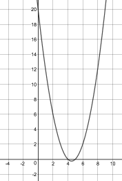
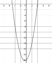
Then put up the additional equations and graphs and ask scholars which equations and graphs represent the same functions. Scholars should have an opportunity to consider the representations individually and then in partners before discussing as a whole class. As scholars share out, ensure that they use precise academic language and prove their thinking.


The purpose of this Mini-lesson is to consider what the graph of a quadratic function that is a perfect square when factored looks like and why. Scholars should leave the Mini-lesson understanding that this is a unique type of quadratic function that only touches the x–axis, but doesn’t cross it. Because both factors are the same, there is only one value that makes the output zero. Therefore this function has just one x–intercept, which is also the vertex.
Put up all of the representations. The goal is for students to determine which representations are connected (i.e., which equations match which graphs). Scholars should have an opportunity to consider the representations individually and then in partners before discussing as a whole class. To review what scholars learned in Lesson 3, you may begin by showing just the factored form of the first equation f(x) = (x – 1)(x – 1) and asking scholars what predictions they can make about the graph based on that equation before revealing the other representations.
The purpose of this Mini-lesson to reinforce scholars’ understanding of the relationship between a graph of a quadratic function and the algebraic representation of the same function in vertex form.
Put up all of the representations. The goal is for students to determine which representations are connected (i.e., which equations match which graphs). Scholars should have an opportunity to consider the representations individually and then in partners before discussing as a whole class.
Key Questions
Scholars should walk away from this Mini-lesson recognizing that not all quadratic functions are factorable. Graphically, scholars should recognize that a quadratic function is not factorable if the function does not cross the 𝑥–axis and therefore does not have any (real) zeros. Algebraically, scholars should understand that if there are no terms that add together to get the 𝑏 term of the standard equation and simultaneously multiply together to get the 𝑐 term of the standard equation the function is not factorable. Through this Mini-lesson scholars should recognize that one of the benefits of vertex form is that, like standard form, it can be used to algebraically represent any quadratic function.
Put up all of the representations. The goal is for students to determine which representations are connected (i.e., which equations match which graphs). Scholars should have an opportunity to consider the representations individually and then in partners before discussing as a whole class.
Put up all of the representations. The goal is for students to determine which representations are connected (i.e., which equations match which graphs). Scholars should have an opportunity to consider the representations individually and then in partners before discussing as a whole class.
This version of Connecting Representations is different than what scholars are used to. Instead of having approximately the same number of graphs and equations, this time they are given one graph with no scale and asked to determine which equations could match. The purpose of this Mini-lesson is for scholars to practice using different forms of quadratic functions to identify key features of a graph as well as to build reasoning skills.
Representations
The purpose of this Mini-lesson is to strengthen scholars’ understanding that any equation can be solved by graphing each side and finding where lines intersect. Scholars should use what they learned in the previous lesson to choose an efficient algebraic strategy to prove their thinking.
Put up all of the representations. The goal is for students to determine which representations are connected (i.e., which equations match which graphs). Scholars should have an opportunity to consider the representations individually and then in partners before discussing as a whole class.
The purpose of this Mini-lesson is to introduce scholars to the word transformation to describe
how a function has changed from its original form. Scholars should be able to use graphs and
tables to identify the how the function y = x2 was transformed. Scholars will recognize that going from x2 to x2 + 4 shifts the function up and going from x2 to (x + 4)2 shifts the function to the left.
Put up all of the representations. The goal is for students to determine which representations are
connected (i.e., which equations match which graphs). Scholars should have an opportunity to
consider the representations individually and then in partners before discussing as a whole class.
Representations
Key Questions
resources
Access a wide array of articles, webinars, and more, designed to help you help children reach their potential.
NEWSLETTER
"*" indicates required fields


